Proven AI Video Lowers Facebook CPL with Complex Services

How AI Video Can Explain Complex Services and Lower Facebook CPL

Some services are easy to show in Facebook Advertising. However, a moving company can show its crew loading a truck. An e-commerce brand can show the product. But what happens when the actual problem is somewhere the customer cannot see?

That is where AI video can become useful. In Facebook Ads, services such as foundation repair, vein treatment, insulation, HVAC, and restoration often need more explanation because the real problem is happening beneath a floor, inside a wall, inside a vein, or above the ceiling. A well-built AI explainer video can make that invisible problem understandable in under 30 seconds.

This is not about replacing real video or filling ads with generic AI content. It is about using AI when a camera cannot show the thing the customer actually needs to understand. For complex services, that difference can have a direct impact on lead generation and Facebook CPL.

🧠The Problem — Some Services Cannot Sell Themselves With a Photo

Traditional visual facebook advertising works well when the customer can immediately see the product or service. A moving company can show a truck, a crew, and furniture being loaded. An e-commerce company can show exactly what someone is buying.

But some services have a much harder communication problem.

A foundation repair company might show a crack in a wall, but the homeowner may simply think it is normal settling. A vein clinic can show a person’s leg, but that does not explain what is happening inside the veins. An insulation company can show pink foam in an attic, but the image does not explain heat transfer, energy loss, or air quality.

The common problem is that the customer can see the symptom but not the cause.

That changes the job of the ad. The creative is no longer just promoting a service. It has to explain why the problem exists and why professional treatment or repair is necessary. When the important part of the problem is invisible, the audience needs the ad to show them something they normally cannot see.

ServiceWhat a Traditional Photo Can ShowWhat Remains UnexplainedWhat an AI Visual Can Demonstrate
Foundation repairA visible crackMovement and pressure beneath the surfaceHow the foundation is shifting
Vein treatmentSwelling or visible veinsValve malfunction and blood flowWhat is happening inside the vein
InsulationInsulation materialHeat transfer and energy lossHow heat moves through the attic
HVACEquipment or ventsWhat is causing the underlying issueInternal airflow or system problems
RestorationVisible damageWhat is happening behind or beneath the damageThe hidden source and progression of the problem

The goal is not to make the ad more complicated. It is to make the problem easier to understand.

🎥Real Video Still Wins — But It Depends on How It Is Made

This is not an argument against real video. When the service itself is visual, real footage can be incredibly powerful. A moving company can show its crew loading furniture, protecting belongings, and completing a move. An e-commerce brand can demonstrate the product, show an unboxing, or capture the product being used. In these situations, the camera can show the customer almost everything they need to know.

The challenge starts when the important part of the service happens somewhere the camera cannot easily reach. A foundation may be shifting underground. A vein problem may be happening inside the body. Insulation may be affecting heat movement above the ceiling. A restoration issue may be developing behind a wall. In these cases, real footage can show the people doing the work, but it may not explain what actually needs to be fixed.
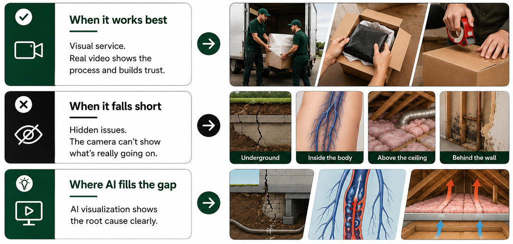
That is where AI visualisation can fill the gap. Video ads still depend on the same fundamentals as any other creative: a strong hook, a clear message, and audience relevance. Production quality alone does not guarantee better creative performance. A simple AI explainer with a clear explanation can be more useful than an expensive real video that never explains the actual problem.

💡Complex Topics Need Explanation — And AI Makes That Affordable

Large companies have used animation studios, medical illustrators, and 3D production teams for years to explain technical ideas. The problem is that this type of production has traditionally been expensive and time-consuming.

For a local business, spending around $15,000 on a single explanatory animation is rarely realistic. AI has changed that equation. A business can now create visual explanations in a fraction of the time and at a much lower production cost.

That does not mean the creative should be rushed or treated as disposable. The advantage is that smaller businesses can now access a type of visual communication that was previously available mainly to brands with large production budgets.

We have seen this approach applied across several different service categories.

SoCal Seismic

For SoCal Seismic, the creative showed what happens beneath the surface when a foundation shifts. Instead of simply showing a cracked wall, the visual explained the movement and pressure happening behind it.

The reported result was a drop in CPL from $133 to $20.

That change came from making the underlying problem easier to understand. The viewer was not simply being shown a crack. They were being shown why that crack could matter.

The Vein Place

For The Vein Place OC, the approach used visual symptom recognition alongside emotional messaging. The creative helped people connect what they were seeing and feeling with a condition they may not have previously understood.

The source does not provide a CPL figure for this campaign, so no specific performance result is being assigned to it here.

Attic Fanatics

For Attic Fanatics, AI visualisation was used to show concepts that a photograph of insulation could not communicate clearly. The creative illustrated heat transfer, energy loss, and the air-quality implications associated with degraded attic insulation.

A photograph can show insulation sitting in an attic. It cannot easily show heat moving through the space or explain how that affects the home. The source does not provide a CPL figure for this campaign.

EZ Home Solutions

For EZ Home Solutions, the creative combined real photography with AI-enhanced visuals to demonstrate attic cleaning and rodent proofing. The goal was to make the condition of the attic feel immediate while also showing that the problem could be addressed.

The source does not provide a CPL figure for this campaign.

Across these examples, the common idea was simple: when the audience could actually see the problem instead of only hearing about it, the creative had more information to work with.

🧭Where AI Video Actually Belongs — And Where It Doesn’t

AI explainer video is not automatically the right choice for every business.

The better question is simple:

Can you show the audience the actual problem and the actual solution with a camera?

If the answer is yes, real video should generally be the first choice. If the most important part of the problem happens somewhere a camera cannot reach, AI can offer something that conventional footage cannot.

That makes AI especially useful for insulation, foundation repair and seismic retrofitting.

It also supports vein and vascular clinics, HVAC, construction, restoration, and other medical or technical services.

Moreover, customers need to understand the underlying issue before understanding the treatment.

Facebook Advertising is less necessary for businesses where the product or service is already highly visual.

AI Explainer Is a Strong FitReal Video Is Usually Better
Foundation repairMoving companies
InsulationE-commerce
Vein and vascular treatmentRestaurants and food service
HVACHaircuts and beauty services
Construction and restorationFitness and coaching
Medical or clinical servicesOther services where the result is easy to show 

The deciding factor is not whether AI is popular. It is whether the technology solves a communication problem that real footage cannot solve as effectively.

🛠️How to Implement AI Video: Start With the Concept, Not the Tool

The easiest mistake to make with AI video is opening an AI tool and immediately generating footage. That is starting at the wrong end.

Before thinking about animation, camera angles, or visual styles, identify what the audience does not understand. The technology should serve the explanation, not become the explanation.

1. Identify What the Audience Cannot See But Needs to Understand

Start by identifying the invisible problem and the misconception standing in its way. With foundation repair, the homeowner may see a crack and assume it is cosmetic. The creative needs to show the structural movement behind it. The question is simple: what could the audience see that would change the way they understand their problem?

2. Write the Outline Before the Script

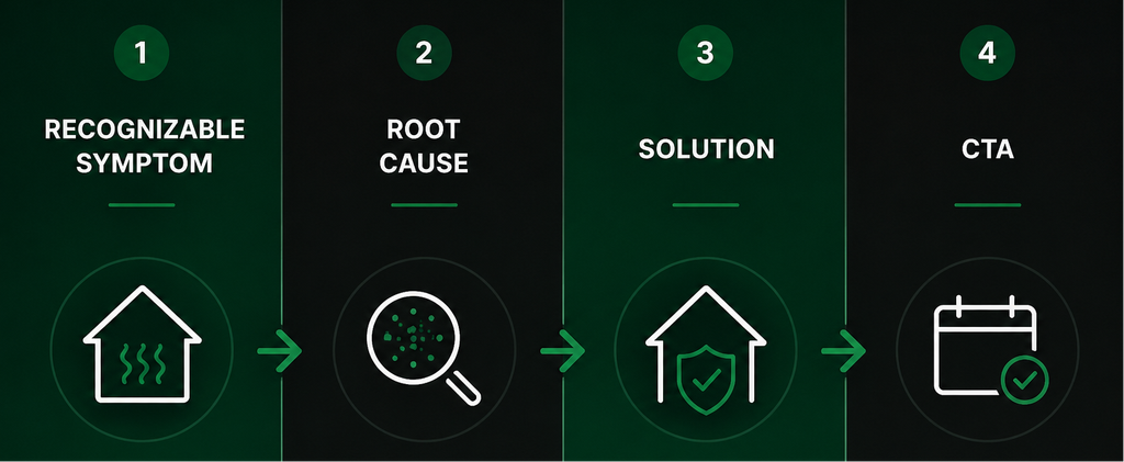
Once the communication problem is clear, map out the explanation using a tight structure:

A simple framework is:
3. Write the Script Before Generating Anything

The script determines what the visuals need to show, what the voice-over needs to explain, where the hook needs to appear, and what the audience should understand by the end. For most Facebook ads, keeping the video under 30 seconds is a useful target.

4. Generate Visuals That Match the Script

Every visual should have a reason to exist. If the script says the foundation is shifting, show the foundation shifting. Specificity is what makes AI useful here. The visual should explain the exact process being discussed rather than simply decorate the ad.

5. Keep the Production Clean and Simple

A Facebook ad does not need Hollywood-level animation. Clear visuals, simple editing, purposeful movement, and strong relevance matter more than technical complexity.

🎯AI Video Is a Communication Tool, Not a Production Shortcut

Real video is generally the better choice when the service is visual and the audience already understands what it is buying. If a camera can show the product, the process, the people, and the result, there is usually a strong reason to use it.

AI video becomes valuable when the problem is invisible, the service is complex, and the audience needs to understand something before it is ready to act. The CPL improvements in the examples above did not come simply because the videos used impressive animation. The creative worked because it showed audiences something they could not normally see and helped them understand what was happening.

That is the real use case for AI in facebook video ads. Not replacing real footage. Not generating content just because AI can. Using visual technology to explain something that would otherwise remain invisible.

Get the concept right, get the outline right, get the script right, and then build the video around it. AI simply makes that visual explanation affordable for businesses that previously could not produce it.

Gary K. Avatar

Top Things to Get Right Before Launching a Facebook Lead Generation Campaign for a Moving Company

Top Things to Get Right Before Launching a Facebook Lead Generation Campaign for a Moving Company

A successful Facebook lead generation campaign does not start when you hit the Publish button. For a moving company, the work that happens before launch can have just as much impact on the final result as the budget, targeting, or ad itself.

Good moving company marketing starts with preparation. Before putting money behind a lead generation campaign, you need to understand the market, know what you are testing, decide what happens when a lead comes in, build an offer worth responding to, and make sure your form filters the right prospects.

Here are five things to get right before spending the first dollar.

Research the Market Before You Build Anything

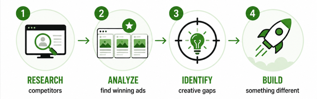
Before creating a single ad, look at what other moving companies are already putting in front of the same audience. Competitor research gives you a much better starting point because you can see which messages, offers, formats, and positioning are already common in the market.

The Meta Ads Library is one of the easiest places to start. Search for moving companies in the markets you want to target and look beyond the first few ads you find. Pay attention to campaigns that have been running for a long time. An ad that has stayed active for months may be giving you a useful clue about what the advertiser believes is worth continuing to spend money on.

The goal is not to copy those ads. It is to understand what your audience is already seeing so your creative strategy can find a better way to stand out.

What to Look for in Competitor Ads

  • Creative format: Are competitors using images, videos, carousels, or a mix?
  • Messaging angle: Are they focusing on trust, price, speed, safety, convenience, or another concern?
  • Offer: What are they giving the customer a reason to respond?
  • CTA: What action are they asking people to take?
  • Video length: If they are using video, how quickly do they get to the main point?
  • Campaign longevity: Which ads appear to have been running for an extended period?

You are not looking for one competitor to copy. You are looking for patterns. Once you understand what the market is already saying, it becomes much easier to find something your ads can say differently.

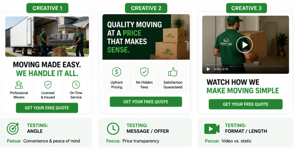
Launch With at Least Three Creatives That Actually Test Something Different

Launching three ads does not automatically mean you are running a meaningful creative test. If all three ads use the same message, same structure, and same offer with slightly different images, you may end up learning very little about what actually drives a response.

Good creative testing requires meaningful creative variation. The ads should differ enough that you can understand whether the audience responds better to one angle, format, length, or style of communication.

This also gives the Meta algorithm more useful signals to work with. Instead of making tiny changes and treating each one as a new test, you can give the campaign genuinely different creative options and use the results to guide future campaign optimization.

Creative VariationWhat ChangesWhat You Can Learn
AngleThe reason someone should careWhich customer motivation gets the strongest response
LengthShort vs. longer messaging or videoHow much information the audience needs before taking action
FormatImage, video, carousel, etc.Which format communicates the offer most effectively
Ad CopyHook, body copy, headline, or CTAWhich message creates the strongest response

The important part is not simply having three ads live. It is making sure each one gives you something different to learn.

Set Up the Lead Flow Before Spending the First Dollar

Getting a lead is only the beginning. What happens in the minutes after someone submits the form can determine whether that lead turns into an actual sales conversation.

Before launching, map the entire process from submission to follow-up. Where does the lead go? Who gets notified? How quickly does someone call? What happens if the person does not answer? These questions should have answers before the campaign starts, not after the first leads begin coming in.

A strong lead follow-up system should connect the Facebook form to the company’s CRM, trigger an immediate notification, and give the sales team a clear process for contacting and following up with the prospect. CRM automation can handle much of the process in the background, but the sales team still needs to know exactly what happens next.

Pre-Launch Lead Flow Checklist

  • 📥 Confirm where Facebook leads are being delivered.
  • 🔗 Test that every submission reaches the CRM correctly.
  • 🔔 Confirm who receives the lead notification. ⏱️ Set a clear target for lead response time.
  • 📞 Make sure the sales team knows how the first call should be handled.
  • 🔄 Create a follow-up process for leads who do not answer.
  • 🧪 Test the entire flow before spending real ad budget.

A campaign can generate affordable leads and still produce poor business results if those leads sit untouched for hours. The ad gets the opportunity. The follow-up process determines what happens with it.

Build the Offer Before You Build the Ad

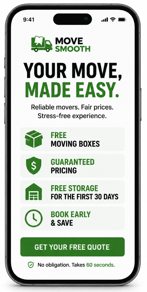
The offer should not be something added to the ad after the creative is already finished. It should help shape the message from the beginning.

For a moving company, the right offer can reduce some of the uncertainty that comes with hiring movers. A customer may be worried about cost, pricing surprises, storage, or simply whether booking now is the right decision. A useful moving company offer gives them a concrete reason to take the next step.

Some examples include:

  • 📦 Free moving boxes: Gives customers an immediate practical benefit and reduces one of the smaller costs associated with moving.
  • 💰 Guaranteed pricing: Addresses the fear that the final bill will be significantly different from what was originally quoted.
  • 🏠 Free storage for the first 30 days: Helps customers who have a gap between leaving one property and moving into another.
  • Discounts tied to booking lead time: Gives customers a reason to plan earlier while creating urgency around the booking decision.

The offer does not need to be complicated. It needs to solve a concern the customer already has.

A free moving estimate, for example, can make the first step feel easier because the customer can start the conversation without committing to a move. The important thing is to decide what the offer is trying to accomplish before building the creative around it.

Build the Lead Form to Qualify, Not Just Collect

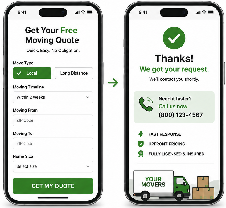
A form with a high submission rate is not necessarily a good form. For a moving company, the real question is whether the people submitting it actually fit the service. Someone looking for a local move is not necessarily valuable to a campaign built around long-distance relocation. Someone planning to move sometime next year may not have the same urgency as someone moving within the next few weeks.

The form should therefore collect enough information to help identify the right prospects without turning into a long questionnaire. Every question should have a reason for being there.

Ask Questions That Reveal the Type and Timing of the Move

Start with the information that tells you what kind of move the person is planning and when it is likely to happen.

For example, asking whether someone is planning a local or long-distance move can help separate the prospects who match the campaign’s service focus. Asking about the moving timeline gives the sales team a better idea of whether the inquiry represents an active opportunity or someone who is only researching.

The point is not to ask everything you possibly can. It is to ask the questions that help determine whether the person is worth a sales conversation right now.

Collect Enough Information for the First Sales Call

Destination or relocation area and property size can give the sales team useful context before the first call. Knowing where the customer is moving and how large the current property is can help the team understand the potential scope of the job and make the first conversation more productive.

These questions can also be structured carefully around Meta’s lead-form restrictions. The goal is to collect useful information without creating unnecessary friction or asking for details in a way that causes the form to become difficult to complete.

A good form should leave the sales team with enough information to understand who they are calling, while still feeling quick and straightforward to the person submitting it.

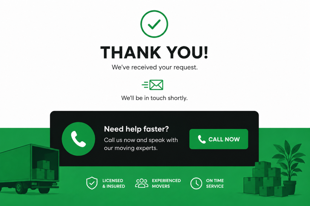
Use the Confirmation Page as Another Conversion Opportunity

The confirmation page should not be treated as the end of the lead-generation process.

Someone who has just completed a form has already shown a level of interest. That makes the confirmation screen another opportunity to encourage immediate action, such as inviting the prospect to call the company directly for faster assistance.

This is especially useful in the moving industry because a person requesting a quote may also be contacting other companies. If the confirmation page gives them a clear next step while their intent is still high, the business has another chance to start the conversation immediately.

Lead Form FieldWhat It Helps You UnderstandHow Sales Can Use It
Move TypeLocal or long-distance relocationConfirm whether the lead fits the service
Moving TimelineHow soon the customer expects to movePrioritize active opportunities
Destination / Relocation AreaWhere the customer is movingUnderstand the scope and logistics
Rooms / BedroomsApproximate size of the movePrepare for the likely job size
Confirmation PageWhether the prospect takes another actionEncourage an immediate call or next step 

The best form is not necessarily the one that produces the most submissions. It is the one that gives the sales team useful information without creating enough friction to drive good prospects away.

The Pre-Launch Checklist for a Moving Company Facebook Campaign

Before putting budget behind a moving company campaign, make sure the basic pieces are already in place.

  • 🔎 Research the market: Review competitors, their creative angles, offers, CTAs, and active campaigns.
  • 🎨 Prepare meaningful creative tests: Launch different angles, formats, lengths, or copy variations instead of cosmetic changes.
  • 🔗 Test the lead flow: Make sure leads reach the CRM, notifications work, and the sales team knows how quickly to respond.
  • 🎁 Define the offer: Give customers a clear reason to take action before building the ad around it.
  • 🎯 Qualify the leads: Ask only the questions needed to identify the right move type, timeline, destination, and job scope.
  • Use the confirmation page: Give high-intent prospects another way to take action immediately after submitting the form.

The biggest mistake is treating these as things to fix after launch. Every lead generated before the system is ready is money spent learning something that could have been prepared beforehand.

For a moving company, the goal is not simply to launch a Facebook campaign. It is to launch a campaign with the creative, offer, lead form, and follow-up process already working together. That preparation gives the campaign a much better chance of turning ad spend into actual moving jobs.

Gary K. Avatar

How Image Ads Cut Lead Costs for an Insulation Company in Houston

How Image Ads Cut Lead Costs for an Insulation Company in Houston

EZ Home Solutions serves homeowners across Houston with attic insulation, attic cleaning, and rodent proofing.

For this Facebook lead generation campaign, we deliberately took a different approach from the video first strategy that dominates much of home services advertising.

Website: EZ Attic Insulation | Texas Insulation Experts

Instead of assuming video was the only format worth scaling, we launched five image creatives built around different homeowner concerns and let the campaign data decide which messages deserved more budget.

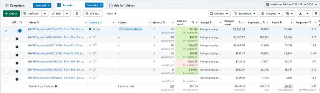
The result was a steady improvement in cost per lead, taking the campaign from a high of $200.13 to $41.45 while generating 187 leads across seven ad sets. The interesting part was not simply that image ads worked. It was why two very specific image concepts eventually emerged as the strongest performers. 

Why Image Ads Were Worth Testing in a Video First Market

Video has become almost the default format in home services advertising. It is easy to assume that if competitors are running video, a new campaign needs video to compete. EZ Home Solutions gave us a reason to challenge that assumption.

Instead of immediately investing in video production, we launched five image creatives at the same time. Each one approached the Houston homeowner from a different angle, while the offer remained consistent. The purpose was straightforward: test the message first. If an image could communicate the problem, create enough interest, and give the homeowner a clear reason to act, there was no reason to dismiss the format simply because video was more popular. The campaign therefore tested image ads based on different homeowner motivations rather than producing multiple versions of one generic concept.

Five Creative Angles Put Different Homeowner Concerns to the Test

The campaign tested five distinct creative angles, each built around a different reason why a Houston homeowner might care about their attic.

💬 Testimonial – Used customer proof to build trust and show that other homeowners had already chosen EZ Home Solutions.

😂 Meme – Used a casual, relatable format designed to feel native to the social feed and create a lower barrier to engagement.

🫁 Health Concern – Focused on indoor air quality, bacteria, and concerns about what may be affecting the health of the household.

💰 Savings — Variation 1 Connected attic problems with high energy bills and the ongoing cost of cooling a Houston home.

💵 Savings — Variation 2 Tested another execution of the financial angle to determine whether the savings message could be communicated more effectively.

What Each Angle Was Designed to Do

The purpose of the test was not to decide whether testimonials, memes, health messaging, or savings messaging were universally better.

Each angle was simply a different hypothesis. A homeowner concerned about rising AC bills might respond to savings messaging. Someone worried about the air inside their home might respond to health messaging. Another homeowner might need social proof before taking the first step.

That is why the test focused on different reasons to care, rather than five minor variations of the same ad. The campaign data could then determine which message deserved more attention and budget.

The Campaign Did Not Start at $41 CPL

The campaign did not immediately produce the $41.45 result. The first ad set spent without generating a lead. When leads began coming through, the costs varied significantly from one ad set to another. The highest recorded CPL reached $200.13 on January 8.

From there, the campaign improved through several rounds of optimization. We removed weaker performers, continued testing, and gradually concentrated spend around the combinations producing more efficient results.

Here is the full progression:

Ad SetLeadsCPLSpend
12/30/2025$159.21
01/02/20266$60.50$362.97
01/08/20261$200.13$200.13
01/12/202610$75.35$753.47
01/27/202628$44.63$1,249.50
02/14/202688$51.23$4,507.82
06/29/2026 (Active)54$41.45$2,238.09

The progression is more important than any individual number. The campaign moved from a $200.13 CPL to $75.35, then to $44.63, and eventually to $41.45 on the active ad set.

Overall, the campaign generated 187 leads from $9,471 in spend. That represents roughly an 80% reduction from the campaign’s highest recorded CPL. The $41.45 result was not created by one sudden change. It came from repeatedly using campaign data to decide what should stay, what should go, and where the next dollar should be spent.

Removing Weak Performers Changed Where the Budget Went

Once enough data accumulated, it became possible to see which ad sets were contributing efficiently and which ones were consuming budget without producing comparable results.

The optimization process became increasingly selective. Rather than allowing every creative and ad set to continue receiving equal attention, weaker performers were removed and budget was progressively concentrated around stronger results. That is where budget allocation became an important part of the campaign strategy and lead generation became more efficient.

The account did not need more ads simply for the sake of having more ads. It needed more of the elements that were already demonstrating a positive signal. The later ad sets show the effect of that approach. The January 27 ad set generated 28 leads at $44.63 CPL. The February 14 ad set generated 88 leads at $51.23 CPL. And the June 29 active ad set reached the campaign’s current low of $41.45 CPL with 54 leads.

The improvement came from several optimization rounds working together, not from one isolated adjustment.

Two Very Different Images Solved the Same Homeowner Problem

After testing five different creative angles, two executions emerged as the strongest performers. They looked very different from each other. One used a real photograph taken inside a contaminated attic. The other used an AI-generated visual showing a cleaner, more polished attic environment. But both were built around the same idea:

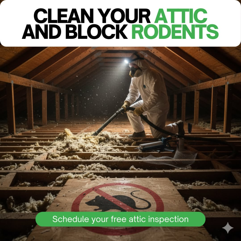
Clean Your Attic and Block Rodents

That gave us an interesting creative test. We were not testing two completely different messages. We were testing two different ways of making the same homeowner problem feel real.

Creative 1 — Clean Your Attic and Block Rodents (Real Photo Version)

  • 📌 Headline: “Clean Your Attic and Block Rodents”
  • 📸 Visual: A real photograph of a technician in full protective gear working inside an attic, including a hazmat suit, respirator, headlamp, and equipment being used to remove contaminated insulation.
  • 🐀 Supporting visual: A rodent block-out sign is clearly visible in the foreground.
  • 👉 CTA: “Schedule your free attic inspection”
  • 🏠 Angle: Two related problems, dirty attic conditions and potential rodent entry, addressed through one service.
  • 💡 Why it works: The photograph feels immediate and real. Instead of telling homeowners that their attic could be contaminated, it shows them what the environment can actually look like. For someone who has never looked above their ceiling, that visual can make an otherwise invisible problem much easier to understand.

Creative 2 — Clean Your Attic and Block Rodents (AI Visual Version)

  • 📌 Headline: “Clean Your Attic and Block Rodents”
  • 👉 CTA: “Schedule your free attic inspection”
  • 🖼️ Visual: An AI-generated wide-angle view of a cleaner attic interior with a technician working inside. The rodent block-out sign remains part of the scene.
  • 🏠 Angle: The same dual-problem message, presented through a cleaner and more polished visual.
  • 💡 Why it works: The real photograph creates urgency by showing the condition of the attic. The AI version puts more emphasis on the result the homeowner wants: a cleaner, treated attic with the rodent issue addressed. It gives the audience a clearer picture of what the finished outcome could look like.

The two executions took different visual approaches, but the underlying message stayed consistent. And that consistency is important because it allowed us to see that the strength of the creative was not coming from the visual style alone. The idea behind the visual was doing much of the work.

Why These 2 Creatives Work — 3 Reasons

1. They Combined Two Problems Homeowners Already Recognize

“Clean your attic” speaks to homeowners who know the space above their ceiling may be neglected, dirty, or in poor condition.

“Block rodents” speaks to a different but closely related concern: scratching sounds, droppings, signs of pests, or the worry that something is getting into the attic. Putting both concerns into one headline gave the creative more reasons to feel relevant without making the message complicated. It still tells the homeowner exactly what the service is about.

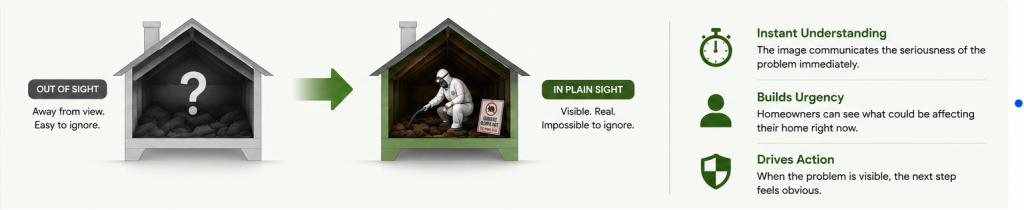
2. The Visual Made an Otherwise Invisible Problem Easy to Understand

Most homeowners are not regularly climbing into their attics to check what is happening up there. That creates a challenge for attic advertising. You are asking someone to care about a space they rarely see. The real photograph solved that immediately. A technician working inside a contaminated attic, dressed in protective equipment, communicates the seriousness of the environment before the homeowner even reads the supporting copy. The AI version approached the same problem differently. Rather than focusing as heavily on the condition of the attic, it made the desired outcome easier to picture. So one creative showed why the homeowner should care, while the other helped show what they could get after taking action.

3. Both Creatives Gave the Problem a Clear Next Step

The headline created the reason to pay attention.

The free attic inspection gave the homeowner somewhere to go from there.

That matters because the audience may suspect something is wrong without knowing how serious the problem actually is. Asking them to immediately purchase a service can create unnecessary resistance. A free inspection is a much easier first step.

The creative says, in effect: there may be a problem above your ceiling. Let us take a look. That connection between the problem, the visual, and the CTA made the creative feel like one complete proposition rather than an attention-grabbing image followed by a generic offer.

The Real Photo Made the Problem Impossible to Ignore

The first winning creative used a real photograph of a technician working inside a contaminated attic while wearing full protective equipment. The technician is shown in protective gear, including a respirator and headlamp, while working inside the attic with equipment used to remove contaminated insulation. A rodent block out sign is also visible in the foreground.

🧹 The headline was direct: “Clean Your Attic and Block Rodents”

👉 The CTA: “Schedule your free attic inspection.”

The strength of the image was that it showed homeowners something they normally never see. Most people do not regularly inspect the space above their ceiling. They may know an attic exists, but they have little idea what condition it is actually in.


The photograph removes that uncertainty. Instead of explaining contamination through several lines of copy, the image shows a professional working in the environment while wearing protective equipment. The visual itself communicates that this is more than a routine cleaning job. That made the homeowner pain point tangible without needing a long explanation.

The AI Visual Focused More on the Outcome

The second winning creative used an AI-generated visual to communicate the same core idea through a different presentation. It retained the same “Clean Your Attic and Block Rodents” headline and CTA, while showing a cleaner, more polished attic environment with a technician working inside. The rodent block-out sign remained part of the scene.

The visual effect was different from the real photograph. The real image creates urgency by showing the condition of the attic as it is. The AI visual puts more emphasis on the result the homeowner wants: a cleaner, treated attic that is also protected against rodent entry.

The two creatives were not competing ideas. They were two different ways of presenting the same message. The real photo made the problem feel more immediate, while the AI version made the outcome easier to picture.

Why “Clean Your Attic and Block Rodents” Was Stronger Than a Single Problem Message

The strongest creative insight was not simply the image. It was the decision to connect two recognizable attic problems in one headline.

Single Problem MessageCombined Message
Focuses on one homeowner concernAddresses attic cleanliness and rodent entry
Relevant to a narrower groupRelevant to homeowners concerned about either problem
One reason to investigate the atticTwo recognizable reasons to take action
Can feel like a routine serviceCreates a stronger sense of overall attic protection

“Clean your attic” speaks to homeowners who know the space above their ceiling may be neglected or contaminated. “Block rodents” speaks to people who have heard scratching, noticed droppings, or simply do not want pests getting into their home.

Putting both together made the message relevant to more homeowners without making it vague. The headline still tells you exactly what the service is about, but it gives the audience more than one reason to care.

That was the real strength of the creative: two familiar problems, one simple message, and one clear next step.

The Image Made an Invisible Home Problem Visible

Most homeowners rarely inspect the inside of their attic, so they have little idea what is actually happening above the ceiling. That creates a challenge for attic services because the problem is out of sight, even when it may be affecting the home. The real photograph solved that immediately by showing a technician in full protective gear working inside a contaminated attic. Seeing the respirator, protective clothing, equipment, and condition of the space made the problem feel real without needing a long explanation.

That is where strong visual communication can make a difference. Instead of telling homeowners that their attic may have a problem, the image showed them what that problem could look like. It turned an otherwise invisible homeowner pain point into something they could understand in seconds. From a creative strategy perspective, that was important because the image did the explaining before the homeowner even had to read the rest of the ad.

The Free Inspection Removed the Final Barrier to Action

The free attic inspection worked because it gave homeowners a simple next step without asking them to commit to a paid service. Someone might suspect there is a problem above the ceiling but still hesitate to request an inspection if they think it will immediately lead to a sales conversation or a service bill. With a free inspection, they could find out what was actually happening before making that decision. There was no price to approve, no contract to sign, and no pressure to move forward.

That made the CTA a natural part of the creative rather than a generic offer added at the end. The image showed homeowners why they might need to look inside their attic, while the free inspection gave them an easy way to find out what was really going on.

What the EZ Home Solutions Campaign Proved About Image Ads

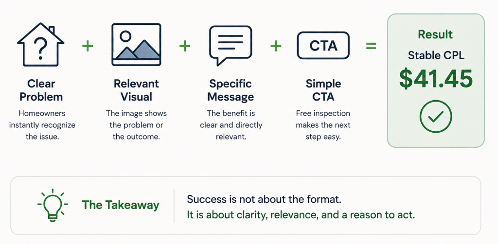
This campaign does not mean image ads will always outperform video. It shows that the format alone does not decide campaign performance. In this case, the combination of a clear homeowner problem, a relevant visual, a specific message, and a simple CTA was enough to bring CPL down to a stable $41.45 without relying on video production.


The two strongest ads made the problem easy to understand in a single image. One showed the real condition of the attic, while the other focused more on the cleaner outcome. Both gave homeowners a clear reason to care and an easy next step through the free inspection.

That is the bigger lesson for meta advertising. Instead of assuming video is the better option because it is more popular, the right image creative should get the same chance to prove itself. What matters is whether the creative makes the problem clear, connects with the right audience, and gives them a reason to act. For EZ Home Solutions, the data showed that a well-tested image could do exactly that.

What We Would Take Into the Next Home Services Campaign

The EZ Home Solutions campaign reinforced a simple approach: test different homeowner motivations, keep the offer consistent, give the campaign enough data to reveal meaningful patterns, and move budget toward what is actually working. Most importantly, don’t assume video is always the answer. Let the audience response and campaign data decide which creative deserves more budget.

For EZ Home Solutions, that meant taking the campaign from a $200.13 CPL to a stable $41.45, with 187 leads generated along the way.

Gary K. Avatar

How One Proven Creative Angle Revived a High-Fatigue Meta Ads Campaign

🚚How One Proven Creative Angle Cut Moving Lead Costs on Maui

Every moving campaign has an expiration date. Run the same message long enough and even the right audience stops responding. In this case study, we are breaking down how HYPE Hyperion Digital used a proven creative angle to reduce cost per lead (CPL), improve campaign optimization, and revive a campaign that had run out of audience to convince.

The client was Wailea Movers, a moving and storage company based in Maui, Hawaii. The campaign focused on Maui-to-mainland moves, which are not simple local relocations. These are not moves where you pack a truck on Friday and unpack on Sunday. They involve weeks of planning, shipping logistics, and a level of trust most customers have never had to extend to a moving company before.

The campaign had already tested multiple creative directions, but performance was declining. CPL was moving into triple digits, some ad sets were producing zero leads, and the audience was clearly tired of the existing messages.

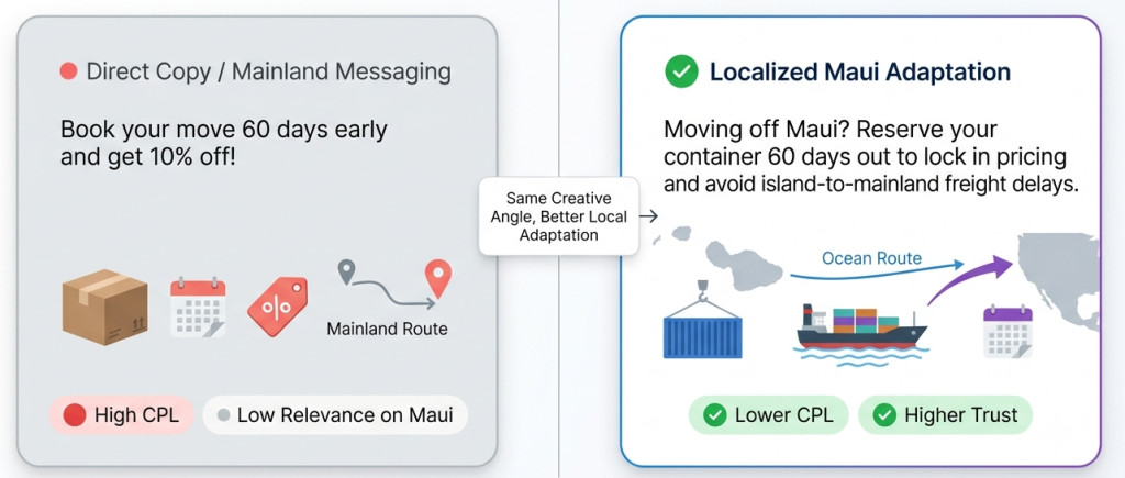
Instead of inventing another random ad angle, we looked at what had already worked across another moving account and rebuilt that concept for Maui’s specific market. This case study follows the market conditions, creative strategy, campaign data, and the lessons we learned from improving lead generation in one of the most limited audiences we have worked with.

🚚Why Marketing a Moving Company on Maui Is Different

Wailea Movers is not operating in a normal mainland market. They are based on a remote island with a much smaller addressable audience than markets like New York, Los Angeles, Toronto, or Miami. That changes what the ads have to do and who they need to reach.

Maui’s population also skews older, which means the audience does not behave like the typical 25-to-40 moving demographic many mainland campaigns are built around. The available market is smaller, the audience cycles through ads faster, and the cost benchmarks cannot be judged the same way as a major metro campaign.

The actual move type is also more complex. Maui-to-mainland moves involve shipping, timing, coordination, distance, and a much deeper trust problem. The customer is not just moving across town. They are loading everything they own onto a barge and watching it disappear into the Pacific often without the ability to supervise or fix problems quickly if something goes wrong.

That is why a generic moving ad was never going to be enough. The campaign needed to speak to the specific emotional and logistical reality of leaving an island, not just the general stress of moving.

🌴The Reality of Advertising in a Small Market

Ad fatigue develops much faster in small geographic markets. In a large mainland city, you can rotate through broader audiences and still keep finding new pockets of people. In Maui, the same people see the same ads much sooner.

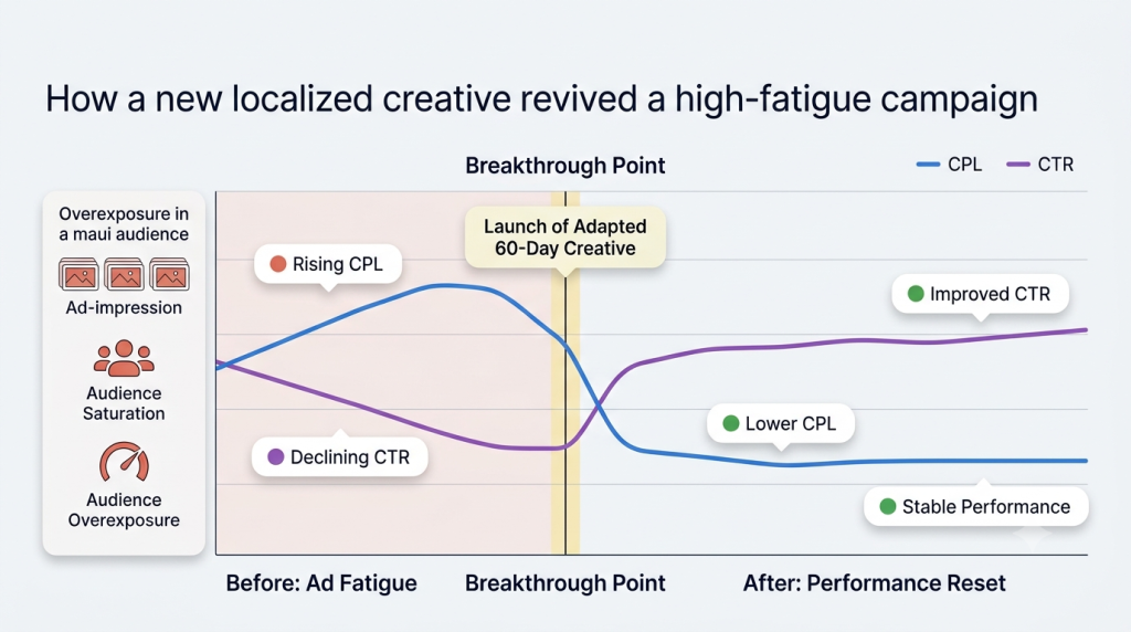
That repeated exposure slowly started hurting campaign performance. The account had already tested different angles, including aspirational messaging, fear-based messaging, FOMO, and direct-response style ads. Some worked for a while, but each one eventually became less effective as the audience became saturated.

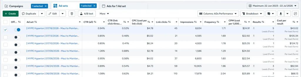
The historical data showed the pattern clearly. CPL started climbing, then the campaign produced two consecutive ad sets with zero leads. At that point, the issue was no longer just targeting or budget. The campaign performance was telling usit had nothing left to say to this audience.

Here is what the lead generation trend looked like before the new angle took over:

Ad SetCPLLeads
06/09/2026$66.137
06/24/2026$92.943
07/06/20260
07/09/20260
07/10/2026$124.721
07/13/2026$105.341
07/16/2026 (Current)$43.025

The audience was still there. The budget was still running. The only thing that changed was that the message no longer felt like it was about them — and on Meta, that is enough for people to keep scrolling.

🔍Looking Beyond the Account for the Right Solution

The next decision came from previous campaign experience. HYPE Hyperion Digital had already seen a timeframe-based angle work well for Cross Country Movers. That campaign used a direct callout around people planning a move soon, which helped qualify buyers before they even clicked.

The question was whether that same creative strategy could work in a completely different market.

On the surface, Cross Country Movers and Wailea Movers were not the same situation. One was built around long-distance moves across mainland markets. The other was focused on Maui-to-mainland moves from a remote island with a smaller and older audience.

But the underlying customer problem was similar: people wait too long, underestimate the move, and only realize the risk once the timeline starts getting tight.

That made the concept worth testing. We were not copying the ad. We were borrowing the framework and rebuilding it around Maui’s specific customer psychology.

⏳Why the 60-Day Angle Made Even More Sense on Maui

The 60-day angle made even more sense for Maui because island-to-mainland moves require more planning than standard relocations. You are not just booking a crew and a truck. You are dealing with scheduling, logistics, shipment timing, availability, and the reality that everything becomes harder when distance and water are involved.

That made the moving timeline feel practical, not promotional. Sixty days sounds like plenty of time until you factor in shipping schedules, crew availability, and the fact that the good slots book out fast. Then it starts to feel tight — because it is.

If someone waits too long, they can lose access to better moving dates, end up with fewer reliable options, or get pushed toward companies that hand the move off to third parties. It is often the difference between a controlled move and a stressful one.

🛡️Turning Real Customer Fears Into the Core Message

The new script focused on fears Maui customers genuinely experience. It addressed broker handoffs, crews without proper accountability, prices changing on moving day, damaged belongings, and the feeling of losing control once the shipment leaves the island.

Those concerns are not generic moving worries. They are especially intense when the customer is thousands of miles away and cannot simply drive over to check what happened. Once the belongings leave Maui, the customer has to trust that the company they hired is still in control.

That is why the script worked harder than a normal trust-based ad. It did not just say Wailea Movers was reliable. It named the nightmares the customer had already imagined. That created stronger customer trust because the message sounded like it understood the real moving experience, not just the service category.

📊Adapting a Proven Angle Instead of Copying It

The campaign reused the underlying framework, not the exact ad. That distinction matters. A proven angle only works in a new market when the message is rebuilt around the new audience’s specific fears, logistics, and buying context.

For Wailea Movers, the framework was the timeframe-based urgency angle. But the execution had to become island-specific. The script needed to talk about Maui-to-mainland moves, not just long-distance moving in general.

This is where many campaigns get it wrong. They copy an ad that worked somewhere else and expect the same result. We adapted the concept instead. That meant keeping the proven mechanic while rewriting the message around Maui’s unique circumstances.

📊What the Campaign Data Told Us

The new creative launched after the campaign had already hit a difficult stretch. Two recent ad sets had produced zero leads, and the campaign had reached a high of $124.72 CPL. The account needed a message the audience had not already tuned out

The 60-day island-specific creative immediately changed the direction of the campaign.

Ad SetCPLLeads
06/09/2026$66.137
06/24/2026$92.943
07/06/20260
07/09/20260
07/10/2026$124.721
07/13/2026$105.341
07/16/2026 (Current)$43.025

The improvement was not only in CPL. It also brought lead volume back. The previous stretch showed the campaign struggling to generate meaningful response, with two ad sets producing no leads and the next two producing only one lead each.

After the new creative launched, the campaign produced 5 leads at $43.02 CPL.Five leads at $43 CPL does not sound dramatic until you remember the previous two ad sets combined for zero leads at any price. The data showed that the campaign did not need a bigger budget to come back to life. It needed a message that matched the moment the customer was actually in.

📈How One Creative Reversed Months of Ad Fatigue

The account had tested multiple creative angles over time, but small-market ad fatigue eventually caught up with them. When the same audience keeps seeing different versions of the same general message, even decent ads can lose their effect. That is especially true in a market like Maui, where the audience pool is limited.

The new script worked because it did not feel like just another moving ad. It spoke directly to the customer’s timeline, risk, and fear of losing control during an island-to-mainland move. That gave the campaign a fresh relevance signal.

The improvement came from creative optimization, not from simply pushing more budget into the account. The learning phase needed a clearer creative signal to work with. Once the message became more specific, Meta had a better chance of finding people who were actively planning a move and likely to respond. That is how one strong creative reversed months of declining performance. It gave the campaign a sharper reason to exist in the feed again.

🌍Why This Angle Continues to Work Across Different Markets

This was the second account where a timeframe-based moving angle worked after other approaches started to plateau. It had already performed well for Cross Country Movers, and it worked again for Wailea Movers.

It was not the lines that worked. It was the idea underneath them — and that idea travelled.

The customer psychology behind both campaigns was similar: people know they need to move, but they often underestimate how early they need to plan. When the ad calls out a specific timeframe, it turns a vague future task into something that feels immediate.

  • The execution changed by market.

    For Cross Country Movers, the angle focused on long-distance planning and choosing the right company.
  • For Wailea Movers, it focused on island-to-mainland logistics, broker handoffs, lack of control, and the real risk of waiting too long in a limited market.

That is why the angle worked across both accounts. The core idea was universal, but the message was adapted to the local context.

🎯Lessons We’ll Apply from Moving Company Advertising

  • The first lesson is that audience context matters more than generic creative concepts. An ad that works in a major mainland city cannot be dropped into Maui without changes. The market, audience size, moving type, and emotional stakes all change how the message should be written.
  • The second lesson is that proven frameworks are valuable when they are adapted properly. You do not need to reinvent the creative strategy from scratch every time. But you also cannot copy and paste an ad from one client to another and expect the same result.
  • The third lesson is that relevance remains one of the strongest performance drivers in Meta advertising. In this campaign, the budget did not save the account. A more specific message did. The ad worked because it spoke to a real planning window, a real fear, and a real moving situation the audience understood.

For marketers managing lead generation in small or highly competitive local markets, the recommendation is simple. Watch for fatigue earlier than you would in larger markets. Track which angles have worked across other accounts. Rebuild proven ideas around the local customer’s specific fears. And when performance starts to decline, do not assume the audience is gone. Sometimes the campaign only needs a message that finally sounds like it was written for that market.

Gary K. Avatar

How iOS Tracking and Meta Optimization Cut App Install Costs

📱How iOS Tracking and Meta Optimization Cut App Install Costs

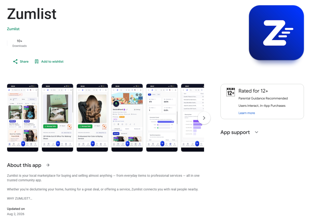
Zumlist came to HYPE Hyperion Digital with a clear goal: launch a meta app install campaign that could drive real installs in New York without wasting budget on poor tracking or weak creative signals. The campaign was not just about lowering cost per install (CPI); it was about building a campaign optimization process that helped Meta understand who was installing, which platform was worth scaling, and which message actually moved the audience.

Zumlist is a marketplace app where people can buy, sell, browse, list, and book locally. That made the campaign structurally different from a single-purpose app install because we were not speaking to one simple user type. We had buyers looking for local services, sellers trying to reach customers, and everyday users who needed a reason to try a new marketplace instead of defaulting to familiar platforms.

This case study breaks down the decisions that shaped the campaign: technical setup, iOS tracking, Android testing, audience segmentation, creative testing, budget consolidation, and Meta’s own algorithmic signals. Each stage helped reduce the install cost, improve performance, and create a stronger framework for future scaling.

🛍️Launching a Marketplace App Meant Solving More Than Just User Acquisition

With a single-purpose app, the value proposition fits in one sentence. With a marketplace, you are selling different things to different people at the same time. If you are advertising a fitness tracker, a meal planner, or a photo editing app, the user value is usually simple to explain. With Zumlist, the value depends on who is using the app and what they want from it.

The campaign had two core audiences:

  • The first audience was buyers. These were people looking for local services, useful listings, affordable options, and a faster way to find what they needed nearby. Their main question was simple: “Is this better than what I already use?”
  • The second audience was sellers and service providers. These people cared about visibility, convenience, and getting in front of local buyers without the friction of traditional platforms. Their question was different: “Can this app help me sell, list, or get booked more easily?”

That is why audience segmentation mattered from the start. Buyers and sellers may use the same application, but they do not respond to the same promise. New York was the right launch market because nowhere else packs buyers, sellers, and service providers that close together — which is exactly what a local marketplace needs to prove it works.

📊Every Successful Campaign Starts With Data You Can Actually Trust

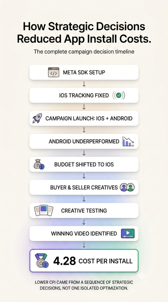
Before the campaign could scale, the technical setup had to work. HYPE Hyperion Digital implemented the Meta SDK for both iOS and Android so installs could be properly tracked and attributed back to the campaign. This was not optional. It was the foundation for every optimization decision that followed.

If conversion tracking is broken, Meta cannot learn properly. The campaign may still spend, but the algorithm has no clean signal about which users are actually installing the app. That creates bad optimization because Meta starts making delivery decisions based on incomplete or unreliable data.

The iOS setup was especially important. It took more effort to get right because iOS tracking often creates more friction, and many advertisers either skip it entirely or ship with broken attribution and hope for the best. That would have been a serious mistake here because a large share of the US app audience uses iPhone, especially in a launch market like New York.

So before a dollar went to delivery, tracking had to be clean enough for every install to teach the algorithm something useful. Every install needed to be readable, attributable, and useful for Meta’s learning system. Once that was in place, the campaign had something solid to optimize around instead of guessing from surface-level metrics.

🍎Why iOS Became the Clear Choice After the First Campaign Results

The campaign launched across both platforms: iOS App Store and Android Google Play Store. This gave us an early read on where the budget should go instead of making assumptions before the data came in.

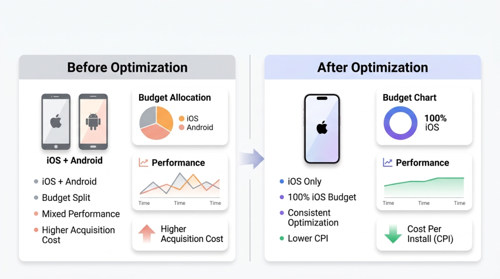
The Android campaign spent $54.05 and returned nothing worth building on. That was enough to show that Android was not the right place to keep pushing at this stage. The issue was not only creative or targeting; it was also platform fit, market share, and user behavior.

In the US market, iOS was the better bet for early adoption. Android represents a smaller share of the audience, and within that audience, the users were less likely to act like early adopters for a new local marketplace app. Once the data confirmed that, Android was paused and the budget was redirected toward iOS.

That decision immediately improved campaign efficiency. The iOS app install campaign had cleaner signals, better install performance, and a clearer path to scaling. Instead of splitting spend across platforms for the sake of coverage, we followed the data and focused budget where the app install cost made sense.

🎯Speaking to Buyers and Sellers With Different Messages

Buyers and sellers needed different messages because they were looking for different outcomes. A buyer wants convenience, local access, better prices, and a faster way to find something useful. A seller wants visibility, easier listing, and a way to reach people who are ready to buy or book.

An ad that tries to speak to buyers and sellers at the same time ends up speaking clearly to neither. If an ad says “find local services” and “sell your services” at the same time, neither side feels like the ad was made specifically for them. That is why creative testing had to separate the buyer and seller perspective.

This made the creative optimization process much cleaner. Each ad had one job and one intended audience. That helped Meta understand who was responding and gave the campaign stronger signals around which value proposition was actually driving installs.

🎨Five Creative Directions We Tested Before Finding the Winner

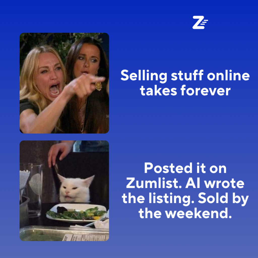
Competitor research showed that strong marketplace app creatives usually lean into one clear communication style. So instead of producing five versions of the same ad, HYPE Hyperion Digital tested five different creative directions: Meme, Product Demo, Aspirational, Price-Based, and FOMO/Direct.

😂Meme creative

The meme format was built to disappear into the feed until it was too late to scroll past. It used a low-barrier, content-style approach so the ad did not feel too polished or promotional. The goal was to make people stop because it felt familiar, not because it looked like a traditional app ad.

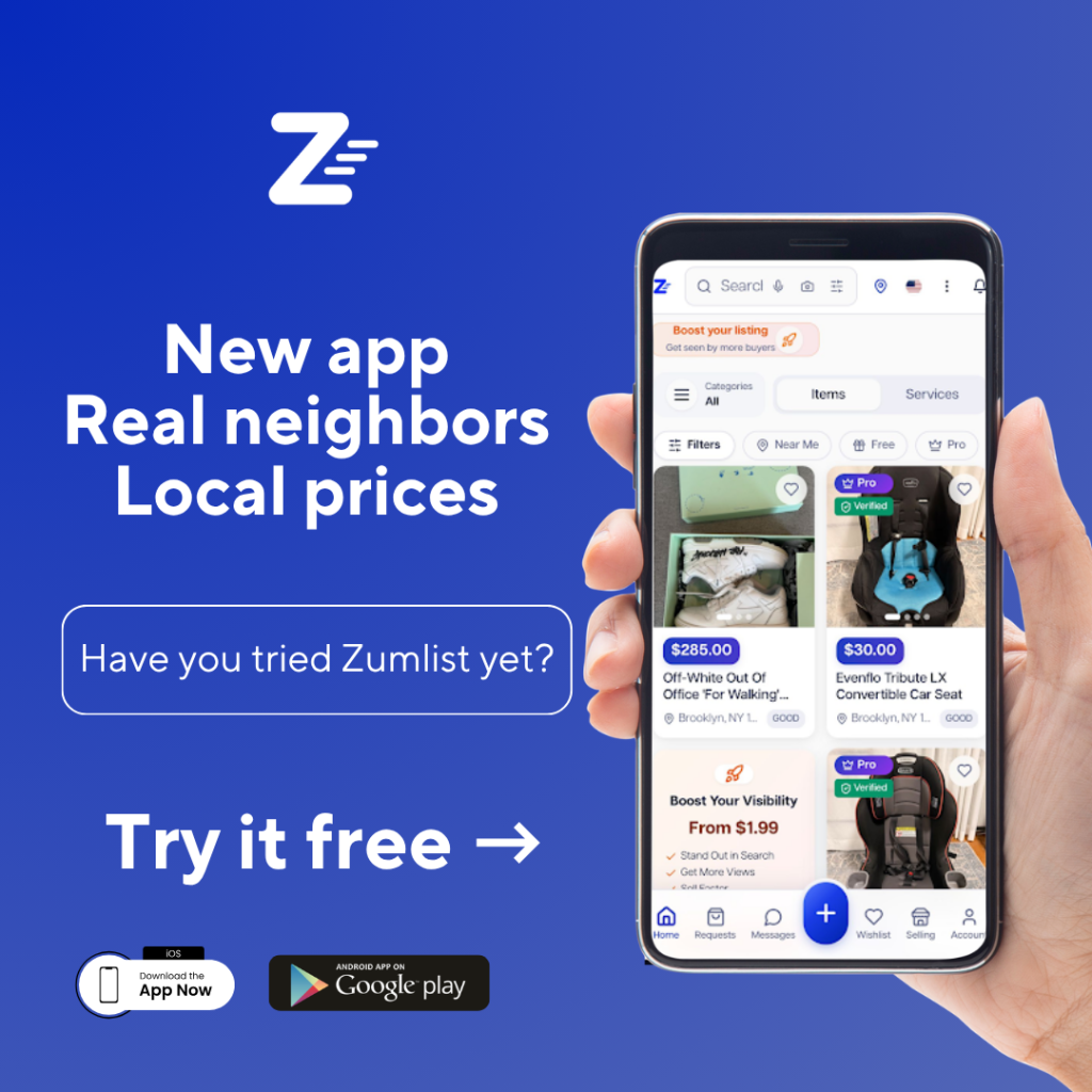
📱The product demo direction

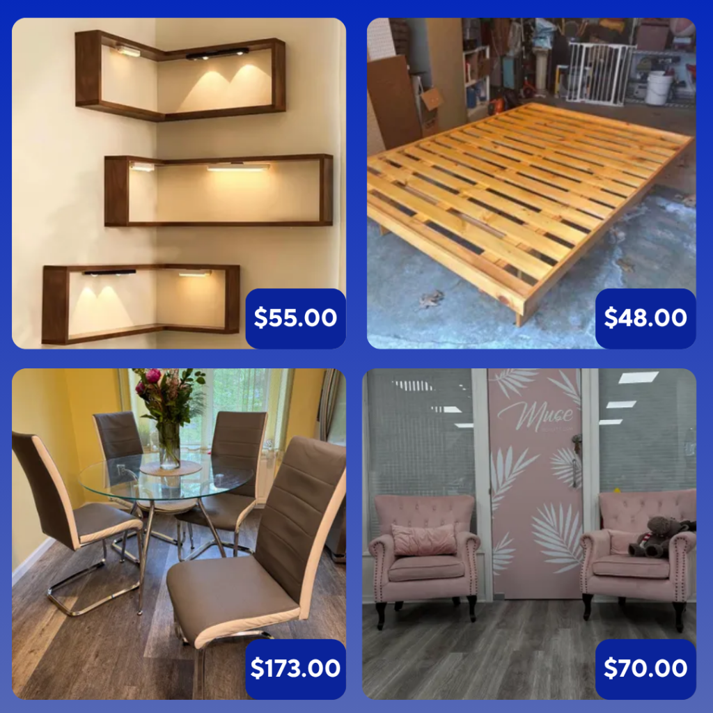
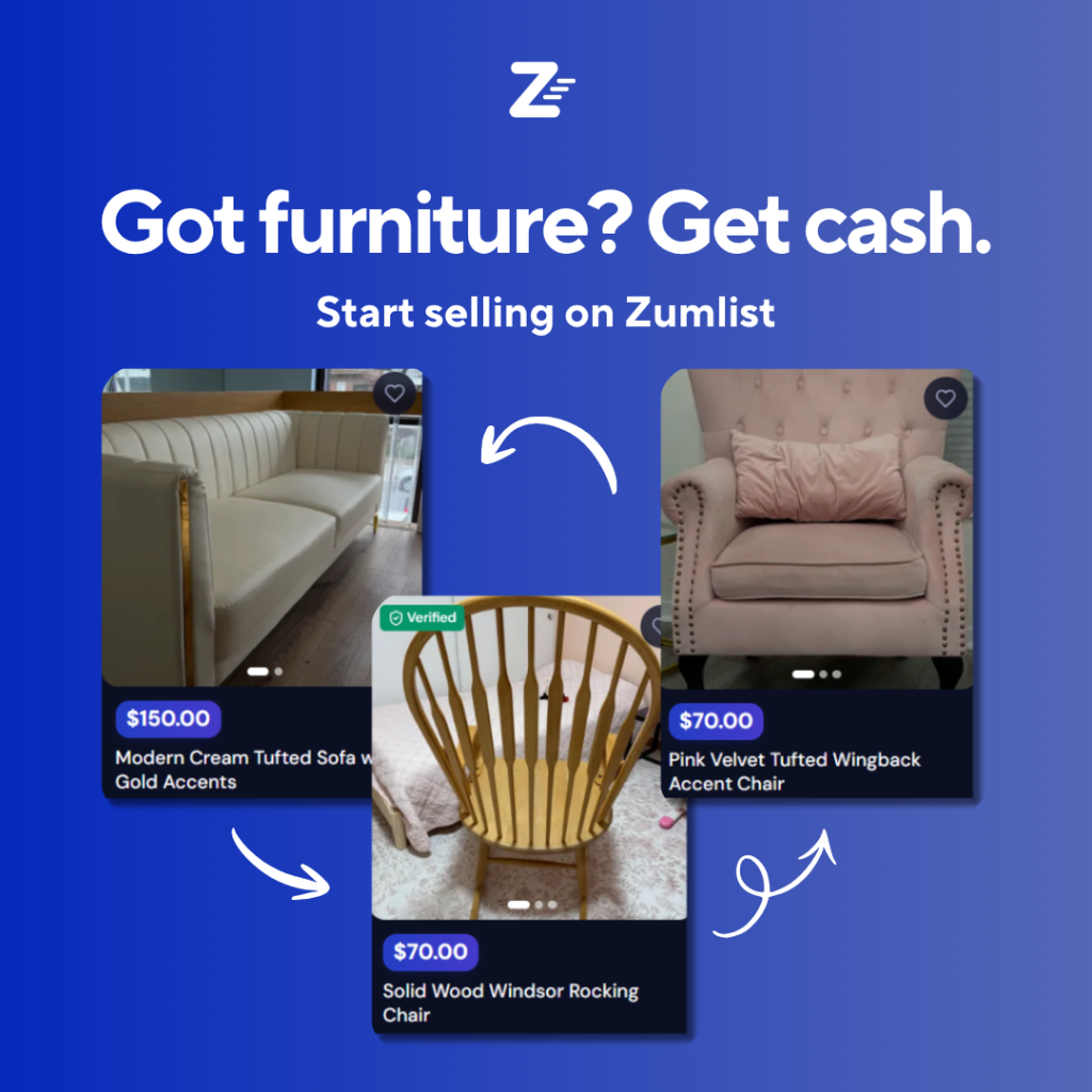
The product demo showed the app interface in action. This creative helped people understand what the app looked like and how they could browse, list, or book through Zumlist. For a new marketplace app, this kind of clarity matters because people often need to see the product before they trust it.

Aspirational

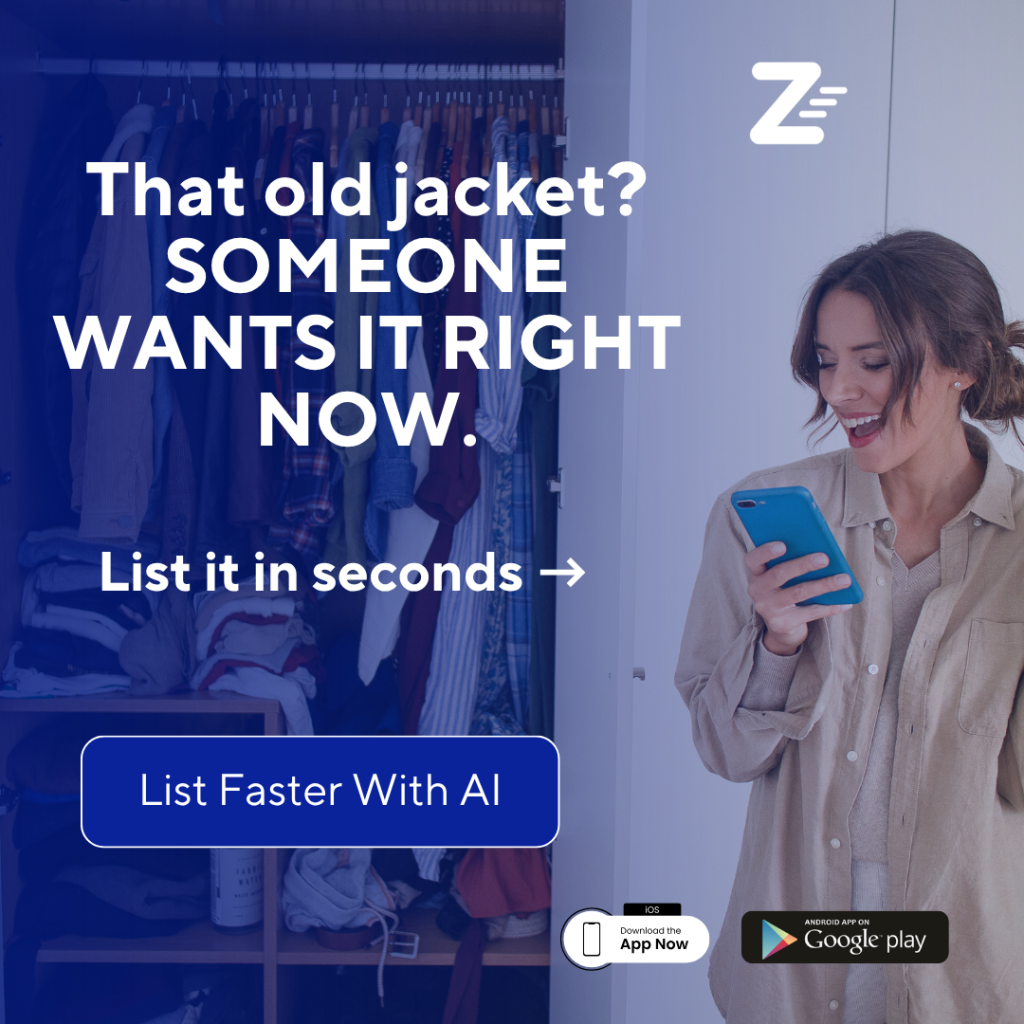
The aspirational angle focused on what users could gain. For sellers, that meant getting value from unused items or reaching the right person faster. For buyers, it pointed toward convenience, local access, and solving a problem without wasting time.

💰Price-Based

The price-based angle anchored the platform around value. It showed listings and pricing to make the benefit feel concrete. Instead of saying “local marketplace,” it showed what kind of deals or opportunities might exist inside the app.

FOMO/Direct angle

The FOMO/Direct angle targeted people who like being first. It encouraged people to get on the platform before it became crowded and positioned Zumlist as a new local place to buy, sell, and get cash. Testing all five angles gave the campaign more relevance than simply changing colors, headlines, or layouts on one basic idea.

🧩Why One Message Couldn’t Speak to Both Audiences

One message could not speak to both audiences because buyers and sellers enter the app with different needs. Buyers want to find something. Sellers want to get discovered. Those are connected inside the product, but they require different reasons to install.

When buyer and seller messaging were mixed together, the value proposition became less clear. The ad had to work too hard, and the user had to figure out which part applied to them. That kind of confusion is expensive in mobile app advertising because people decide quickly whether an app is worth installing.

Keeping each creative focused on a single audience made the communication stronger. A buyer creative could focus on browsing, local prices, and useful listings. A seller creative could focus on posting faster, earning money, and reaching local demand. That clarity aligned better with Meta’s optimization because every install signal was tied to a cleaner message.

📊What the Campaign Data Told Us

The data showed three important things. First, iOS was clearly outperforming Android. Second, the combined setup gave Meta enough learning signal to find cheaper installs. Third, one creative eventually stood out so strongly that Meta pushed almost all video budget into it.

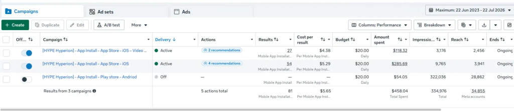
At the campaign level, iOS delivered the installs while Android did not justify continued spend.

CampaignInstallsCost Per InstallSpend
iOS — Video Ads27$4.38$118.32
iOS — App Store (Image)54$5.29$285.69
Android — Play Store$54.05
Total81$5.65$458.04 

The iOS campaigns delivered 81 installs combined from $458.04 in total spend. Android spent $54.05 and produced nothing meaningful, which confirmed the platform decision. The best campaign-level CPI came from the iOS video campaign at $4.38 per install.

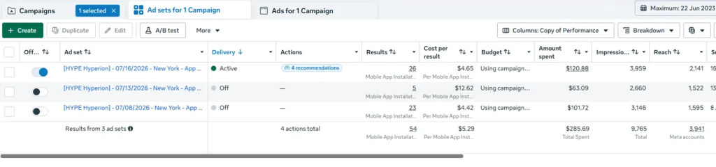
At the ad set level, the data showed how sensitive app install campaigns can be when the budget gets split too thinly.

Ad SetInstallsCost Per InstallSpend
07/08/202623$4.42$101.72
07/13/20265$12.62$63.09
07/16/2026 (Active)26$4.65$120.88 

The 07/08 ad set performed well at $4.42 per install. Then the 07/13 test spiked to $12.62 CPI after the campaign was split into three separate creative tests. Once the campaign was consolidated again, the active 07/16 ad set returned to a healthier $4.65 CPI with 26 installs.

At the ad level, Meta’s decision was even clearer.

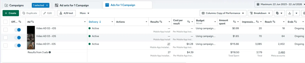
AdInstallsCost Per InstallSpend
Video AD 01 — iOS27$4.28$115.66
Video AD 02 — iOS$0.99
Video AD 03 — iOS$1.65

Meta allocated almost all budget to Video AD 01 immediately. Video AD 02 and Video AD 03 received almost no spend, which showed that the platform was already detecting a stronger performance signal from the first video. Video AD 01 produced 27 installs at $4.28 per install, making it the best individual creative in the account.

🧪The Experiment That Nearly Tripled Our Cost Per Install

Midway through the campaign, the team split the budget across three separate creative tests to isolate performance. It looked like the right call. The data disagreed. We wanted to isolate performance, understand which creative was winning, and avoid relying only on blended campaign data.

But the data showed the downside quickly.

When the campaign was split, the cost per install jumped from around the $4 range to $12.62. That was not because the audience suddenly became bad or the app became less attractive. It happened because the budget was fragmented across separate tests, giving each ad less data and weakening Meta’s learning signals.

This matters because the learning phase needs enough conversion volume to optimize properly. When spend is split too thinly, the algorithm has less room to learn, fewer installs to evaluate, and more uncertainty in delivery. The result is often higher costs, even when the creative itself is not the problem.

Once the campaign was consolidated back into the combined setup, performance recovered. CPI dropped back to $4.65 in the active ad set. That told us the campaign did not need more fragmentation. It needed enough budget density for Meta to keep optimizing around the strongest install signals.

🤖Meta Identified the Winning Creative Before We Did

The ad-level data made one thing obvious: Meta identified the winning creative almost immediately.

Video AD 01 received $115.66 in spend and produced 27 installs at $4.28 CPI. Video AD 02 received only $0.99. Video AD 03 received only $1.65. That was not a delivery issue. That was the meta algorithm reacting to early performance signals.

This is where algorithmic optimization can be useful when the campaign structure is clean. Meta saw that Video AD 01 had the strongest chance of driving installs and moved the budget there faster than a manual test would have. Forcing equal spend across all three videos would have cost more money just to arrive at a conclusion Meta had already reached with $2 of test budget.

The lesson is not to hand the wheel to the algorithm and walk away. The lesson is to give Meta the right structure, clean tracking, and clear creative options. When the signal is strong, the platform can identify the winner quickly. In this case, the best move was to trust the signal and use Video AD 01 as the foundation for the next scaling phase.

Video AD Example:

💡Lessons We’ll Carry Into Every Future App Install Campaign

  • The first lesson is that tracking comes before scale. If the SDK is not implemented properly, conversion tracking becomes unreliable, and the campaign is forced to optimize with weak data. For mobile app advertising, that is one of the fastest ways to waste budget.
  • The second lesson is to choose platforms based on data, not assumptions. Android was tested, but the results did not support continued spend. iOS delivered the better install volume, better CPI, and stronger signal for the New York launch market, so the budget moved there.
  • The third lesson is that marketplace apps need audience-specific messaging. Buyers and sellers may exist inside the same app, but they do not care about the same benefit. Separating the creative by user intent made every message clearer.
  • The fourth lesson is to avoid unnecessary budget fragmentation. Splitting creatives can feel logical when you want cleaner manual testing, but it can damage Meta’s learning phase if the budget is too thin. In this campaign, consolidation outperformed fragmentation.

Right now, the campaign stands at 81 total installs from $458.04 in spend, with a blended $5.65 cost per install. The best individual video creative produced installs at $4.28, iOS remains active and optimizing, and Android has been turned off.

The next phase is not to rebuild the strategy from scratch. It is to scale what already worked: keep iOS as the primary platform, build around the winning video, maintain clean tracking, and expand beyond New York using the same audience-specific creative structure.

For future Meta App Install campaigns, the practical recommendation is simple: fix tracking first, let the data choose the platform, separate audience messages, avoid splitting budget too early, and scale the creative that Meta is already rewarding.

Gary K. Avatar